Glasgow School of Art Degree Show 2009

Every year about this time, Glasgow School of Art holds its annual degree show – a collection of works by all the college’s students who are up for examination. It covers a wide spectrum of visual art – from painting, photography and sculpture to product and graphic design and video art. While there are always one or two ne’er-do-wells whose work seems half-arsed, the standard is usually very high. This year’s show is no exception.

Last year’s sensation was James Houston’s video remix of Radiohead’s “Nude”. Nothing this year has had the same impact on the world’s media. Things like that don’t come around too often.

I couldn’t hope to do the full show justice. I think I saw most, if not all of it. My method tends to be one of aimless wandering waiting for something to grab my attention. Sculpture usually seems the weakest form – often fairly aimless 3D collages, weird carpentry, ludicrous furniture or abstract shapes in bright primary colours. One fairly ghoulish piece consisted of a load of small sample vials suspended head height and labelled with a variety of noxious substances. Whether the garish coloured liquids, harmless looking crystals and powders were what they said they were is a moot point – asbestos, arsenic, cadmium, Hepatitis-B infected blood etc. You didn’t want to stand too close! I neglected to get the artist’s name – I was backing away too quickly. The other sculpture I really liked was by Kenneth Creanor. A twisted humanoid absorbed into rock with gaping holes in his back and side revealing a lush growth of moss. Disturbing.
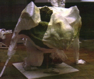
Kenneth Creanor's humanoid rock sculpture

Kenneth Creanor's humanoid rock sculpture

There wasn’t that much photography on show. The series that stood out for me were Jennifer Fergie’s giant prints of bleached out minerals, paper, chalk and wood chips. Reduced to postcard size they don’t have the same textural impact.

Painting remains the dominant medium in the Fine Arts section. What struck me generally was the dominance of surrealism, whether views of toilets in living rooms or bizarre juxtapositions of objects and figures, with Dali and Magritte’s playful influence cropping up all over the place. The most striking examples of this kind were the large, incredibly detailed canvasses by Rachel Wright. Classical and mythological figures loomed out of mazes of Doric columns, pinnacles and obelisks – some as sharp as spears – all radiating from different angles. The example on her promotional postcard that I’ve reproduced features a mean looking Cereberus, the three headed canine guardian of Hades.
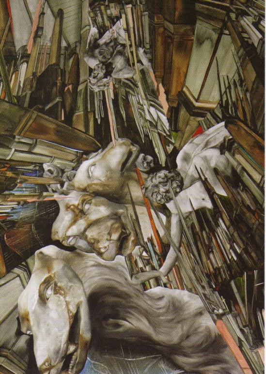
One of Rachel Wright's classical nightmares

One of Rachel Wright's classical nightmares

My favourite group of works were by Sophie Manhire. Her collection of stark paintings of doors and windows varied between impossible gloom, to barely sketched white. All devoid of all but the slightest of contrast. Their claustrophobic nature was highlighted by the central piece where a door opens to the outside, revealing the only colour. Instead of making it a bright, pastoral scene, the view was the forbidding browns and greens of an autumnal dusk. Even so, it was a glimpse of freedom amongst the gloom of the other pieces.

Of the installations, the two that stood out for me couldn’t have been more different. A whole wall was given over to a series of letters to various companies beginning “Dear Sir/Madam, My name is Harriet Lowther…” where she went on to praise everyday objects that she enjoyed – from her favourite brands of sweets to the Glasgow Subway. Also displayed were the replies that she got from harassed consumer departments, a mixture of bewilderment, corporate speak and genuine joy. Some were very funny (and she also seems to have got a lot of vouchers and freebies!). My favourite was her rather panicky second letter to Jessop’s, the camera people, in which she was alarmed that they were ‘investigating’ her comments! Sweet and funny, but also a worthy reminder of how people are quick to complain but very slow to praise.

Robbie Thomson’s dark room was the stuff of haunted house nightmares. The space was divided up by doorways that you could only find by touch. There was some light, but it was so dim that it only illuminated a few details. A sheet billowed in front of a fan whilst a cassette attached to a bewildering array of wires and rusty old circuitry provided a soundtrack of nightmarish creaks and groans. In one corner, a battered and modified piano with its strings exposed played a series of metallic drones. It was far too dark to work out how it was making the sound unaided. Dead spooky, though.

The product and graphic design sections were uniformly excellent. I liked the Faber film books whose covers were based on the tag cloud method of highlighting key themes and names. I also thought Aidan Watson’s portable hydropower mechanism was genius. It’s a small water turbine attached to a float that you place in a fast moving stream or small river, and it will generate electricity to recharge your laptop or mobile phone. A little bulky for hikers, perhaps, but a boon for people who are camping or working in areas a long way from reliable mains electricity. I hope someone takes the idea up – it has the potential to be as iconic as Trevor Baylis’s clockwork radio.

Finally, a mention for Joseph Mann’s stop-motion animated short “The Chimney Sweep”. It’s a delightful, heart-warming little film featuring a sweep who loses his lunch whilst sat on a roof, and a little boy with a model aeroplane. I’ll not give the plot away! (you can see the film at josephmann.co.uk)
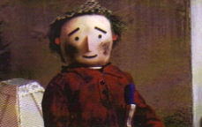
A scene from Joseph Mann's delightful animated short "The Chimney Sweep"

A scene from Joseph Mann's delightful animated short "The Chimney Sweep"

The show continues until Saturday 20th June at the Glasgow School of Art, between 10.30 and 4.30. Get down if you can.

Harry Smith Anthology Remixed (CCA, Glasgow) / Glasgow School Of Art Degree Show

In the first half of the twentieth century, the American record industry was purely about ‘the now’. Music was recorded, records pressed and sold, and everybody moved on to the next thing. There was little attempt to go back, take stock, and put the growing recorded legacy into some kind of context (with the possible exception of jazz). That changed in 1952 when experimental filmmaker and record collector Harry Smith compiled the groundbreaking Anthology of American Folk Music, a series of three double vinyl albums issued on Folkways Records. It’s a project that was only made practical by the invention of the long playing microgroove record just a few years before. Smith took as his parameters the period between 1927, when electrical recording became standard thus allowing a far better sound quality, and 1932 when the music industry had retracted to almost a tenth of its previous size due to the Depression, and folk music recordings had almost ceased completely.

The 84 recordings he chose were split into three broad themes – Ballads, Social Music and Songs (a fourth collection, Labor Songs, remained uncompleted until 2000 when it was issued alongside the others by Revenant Records. It’s not been included in this project.). Each song was accompanied by a short liner note written by Smith, under a tabloid newspaper style headline which acted as a witty encapsulation of the story told within. Many of the songs are now very familiar – “Single Girl, Married Girl”, “See That My Grave is Kept Clean”, “Henry Lee”, “The House Carpenter”, “Kassie Jones” etc etc. This is hardly surprising since the collection was extremely influential on the fifties folk revival, and songs were plundered by the likes of Bob Dylan, Judy Collins, Dave Van Ronk, Odetta, Joan Baez and virtually everybody else on the Greenwich Village coffee house scene. Van Ronk put it best when he said “we all knew every word of every song on it, including the ones we hated.”

Harry Smith Anthology Remixed has a simple premise: take each of the 84 songs, and ask an artist to create a visual representation of it. The result is an exhibition that’s as witty, moving, innovative and human as the songs themselves. Contributors to the exhibition include musicians like Michael Nyman, DJ Spooky, Yamantaka Eye, Vashti Bunyan and Jad Fair, as well as a whole host of established and up-and-coming visual artists. Media used includes graphic art, collage, photography, painting and sculpture – but each piece is uniformly sized and framed.

Bill Drummond’s response is typically anti-art, coming in the form of an e-mail message suggesting that he couldn’t think of a suitable artistic statement. But most of the artists have taken the challenge seriously and come up with something thoughtful and original. Some I particularly like include Mark Vernon and Barry Burns’ spoof medicine show poster for Coley Jones’ “Drunkard’s Special” which includes a whole host of made-up entertainers and entertainments including a paper aeroplane competition. New York musician Jeffrey Lewis has turned Uncle Eck Dunford’s “Old Shoes and Leggins” into a very funny comic strip, which reminded me a bit of Robert Crumb. In complete contrast, :zoviet*france: illustrate Joseph Falcon’s “Arcadian One-Step” with a small metallic sculpture inspired by the accordion.

It’s a fascinating project. Smith died in 1991, but were he still alive today I think he would have been thrilled with the varied and original responses to the tunes he collated.


***


Earlier, I attended the annual degree show at the Glasgow School of Art. It’s something I’ve meant to do in previous years but never have. I was very impressed by the general standard. Cynically, I expected to be confronted with a lot of sculptures consisting of a load of crap strewn on the floor, and semi-abstract paintings created with all the feeling and skill of a bored three year old, intermingled with a few oases of inspiration. OK, there was some of that – a few things that reeked of “will this do?” following three years spent in the pub, but on the whole, the standard of work was very high indeed – easily as good as many things I’ve seen at GoMA or the Tate Modern. The sheer volume of work on show meant that even spending a whole afternoon there was not enough to give many pieces more than a cursory glance. I probably missed a good deal completely. There was a lot I liked. Jonathan Barr had a series of sky photos that were almost featureless, and yet somehow very involving – like a visual equivalent of ambient music. In contrast, Susan Kennedy’s cannibalistic paintings were deeply disturbing. Technically they reminded me of Goya’s ‘black period’, but the subject matter was even darker – ordinary looking people holding severed heads, limp body parts, and in a couple of cases eating them.

Star of the show was undoubtedly James Houston, who also won the top prize. His video remix of Radiohead’s “Nude” using obsolete computer peripherals and a ZX Spectrum has quickly become an internet legend. It is fantastic, although not a million miles away from the work of established cut-up artists like EBN and especially Hexstatic. His short MTV indent piece is, to my mind, even better.

MTV from James Houston on Vimeo.

The artist I left most impressed by was Akiko Ueda. Her series of landscapes were inspired by a winter visit to northern Sweden. Some are simple charcoal lines on white paper, and some a combination of paper and painted glass which gives a misty 3D effect. They capture perfectly the icy, grey-white stillness of the Arctic winter. I found them absolutely stunning.

The Harry Smith Anthology Remixed is on at the CCA, Sauchiehall Street, Glasgow until July 26th. The GSA degree show has now finished.

Website
http://www.cca-glasgow.com/events/harry_smith.html